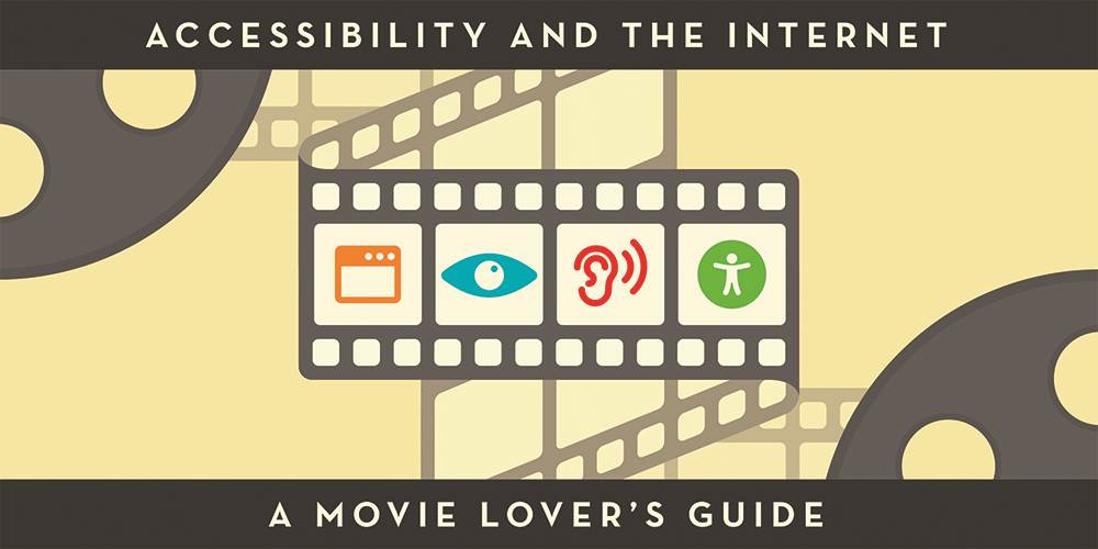
Website accessibility is an often overlooked component of website development. It can be confusing to understand why you need to make your business website accessible, learn what's important, and figure out how to do it.
To make it easier, we're giving a brief history of website accessibility and a a beginner's guide to accessibility issues.
Plus, we'll show you 5 tips for making your site accessible.
A Brief History of Website Accessibility
Act 1: The Internet is Good: Simple and Sweet
Once upon the birth of the internet, most websites were fairly accessible.
Back then (in the early 1990s), the internet was much simpler. The majority of websites were mostly filled with text, with maybe an image or two and some links sprinkled in.
Pretty simple. That meant that user experience was good. Webpages weren’t very complicated to consume and navigate.
So most everyone, including people with disabilities, such as those with visual impairments, could read webpages. Even the earliest iterations of screen reader software could read them with ease. The internet was sweetly innocent, simple, and accessible in black and white.
Act 2: Hidden Elements Lurk Around Every Corner
Then, in the early 2000s, website design and development blossomed. This made the web a visually beautiful place, like the land of Oz. But drawbacks loomed like wicked witches hiding behind bushes.
Look! Websites could inject content dynamically! Boo! Elements could be hidden until you interacted with them! Sliders, carousels, hidden navigation, nested articles, locations, recipes, products, and more (Oh my!).
For some, this new era of the web was visually stunning with its buttons, tabs, colors, animations and more.
But for disabled users, the beauty and fancy functions came with a price: they couldn’t use the websites because their screen readers couldn't interpret all the bells and whistles of images, decorative elements, flash elements, etc. These were inaccessible websites. In other words, all of the neat things that could be done when making websites cool and creative actually created an accessibility nightmare.
Ensuring websites are accessible to all people is the moral and legal responsibility of business owners. You wouldn’t turn away customers with disabilities at your business’s front door, would you? Websites are legally required to be accessible by as many individuals as possible.
If you are a government, financial, or social services organization, this is especially important. Legal action can, and has been taken, against organizations because of their lack of accessibility.
Legal action can, and has been taken, against organizations because of their lack of accessibility.
Act 3: Never Fear: Help is on the way
Although the World Wide Web Consortium (W3C) led by web inventor Tim Berners Lee wrote digital accessibility guidelines early on in the world wide web’s life, it was ignored just like Dr. Malcom’s warnings about cloning dinosaurs.
But over time, organizations, companies, and individuals came together like the Avengers to develop web content accessibility guidelines and emphasize their importance in good website development practices for websites and mobile apps.
The entirety of the web isn’t there yet, but we can all strive for the goal of being compliant with the current guidelines, WCAG 2.2, which was released in October 2023.

5 Tips to Hit the Target of Website Accessibility

1) Start with the (Web) Script: HTML5
The start of any accessible website is proper structure. Just as with making a movie, the structure (or script) is where you start and gets you off in the right direction. Using HTML5 and ARIA landmarks, website structure can be standardized and logical.
HTML5 helps make the structure of a website more logical with strategically named blocks to organize and label content. ARIA landmarks help define the meaning of properly structured HTML5 elements. Defining the meaning of these blocks instructs assistive technologies on what the content within these areas are and their purpose.
Talk to your web developer about using HTML5 and ARIA to improve accessibility.

2) The Keys Are Key
Imagine using your desktop computer for a whole day -- without your mouse. Think it's something out of a horror flick? Millions of individuals suffer from a range of disabilities and diseases that limit their ability to use a mouse. And don’t forget people with temporary disabilities, such as eye surgery, broken arms, or sprained fingers.
Keys, as in keyboard keys, as in keyboard navigation, are the key to accessibility. Keyboard navigation is about letting your visitors choose how they will interact with your website and consume its content.
Talk to your web developer about using HTML5 and ARIA to improve accessibility.
It is extremely important for your website to be accessible using only the keyboard. Use the proper elements, and get assistance from scripting language.
Keyboard navigation and accessibility are not only for individuals with limited vision or blindness. Accessible websites benefit those with many other disabilities and diseases.
Just like movies have closed captioning and audio descriptions, your website needs to be equally accessible for all.

3) Color Makes an Impact
Color and contrast are not to be overlooked in terms of accessibility. In the United States, as many as 8% of males and 0.5% of females suffer from red-green color blindness. This is not even counting blue-yellow and complete color blindness.
The most readable contrasts are, of course, black-on-white or white-on-black. Contrast is important when trying to read on any device. Avoid clashing colors (such as green on pink).
Choosing colors wisely can provide a visually pleasing experience both for users who suffer from color blindness, and those who don’t.
In short, black and white is best.

4) Table It For Later
Tables are a relic from days past that we no longer need in 99.9% of situations. Tables were often used to structure an entire website. Although it was known to be less than best practice, it was also about the only option for much of the web. So, what are tables for today?
Tables are for tabular data only, nothing more. Think of tables like a spreadsheet on your website. If you wouldn’t place content within a spreadsheet specifically, then a table is not what you want. Tables require specific formatting and structure to be accessible and provide a fast and efficient way of consuming their data. If you still use tables on your webpages, accessibility may be compromised

5) Let Your Audience Be Your Guide
We all like to think we know best. We run our business successfully, and that should translate to the website development, right?
Wrong.
Never assume that you know how your visitors will interact with your website. Meaning, don’t just do things because you assume that is how the user wants to consume content or interact with your website.
A website is meant to serve your clients and potential clients. Web developers can provide multiple ways to navigate, interact, and consume content easier.
Your customer’s journey has as many combinations as a movie theater snack bar. Our job is to make the snack bar easily self-service, ensuring the website elements are functional and giving the visitor control of what happens next.
A moviegoer with an armful of snacks is a happy moviegoer. A web user armed with the ability to easily zip around your website is a happy user – and likely a customer.
To continue our movie analogy, look at Sonic the Hedgehog. When the movie character debuted, moviegoers lambasted the movie creators over Sonic’s creepy appearance (human teeth?)
But did the moviemakers listen?
Yes! The producers gave Sonic a makeover prior to the movie's release.
Was that expensive? Yes, (to the tune of about $5 million.) But the gamble paid off. In 2021, the film grossed over $300 million and was the highest-grossing video game movie, according to cinemablend.com. A sequel was released in 2022 and a second sequel is due in 2024.
See what great things can happen when you listen to your audience?
For web accessibility, meaning individuals with disabilities and the public in general, we don’t need to assume anything. The data already shows how these users want to use websites. Listen to your audience.
Epilogue: The Accessible Conclusion

Ensuring your business website is accessibility is a critical step to take to ensure a good user experience (UX) for your customers and a better bottom line for your business. It also can protect your company from website accessibility lawsuits.
With the assistance of professional partners, your web agency can can ensure your website meets these accessibility guidelines.
With ongoing accessibility reviews, your website will live happily ever after.
Ready to take action? Contact Us!