So you have an idea for a new page on your website. You know what the content should be. But what is the best design for a website? How should it look?
Staring at a blank page can be intimidating, especially if you don’t have templates in place to give you some direction on how to bring your content to life.
So if you're wondering how to design a web page, here are some basic design principles to consider.
Set a Hierarchy
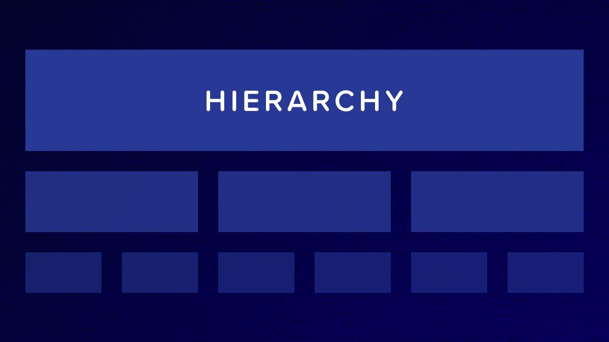
What is the most important information you want to convey? Users generally scan over pages more than carefully read them, so structure your content in such a way that they can quickly zero in on the information that interests them.
An enticing headline and large photo at the top of the page can set the tone so the user has an immediate, high-level understanding of what to expect from the page. From there, use smaller headings (H2, H3, and H4), bold type, and more images to make your content easier to digest and guide your users to the specific calls-to-action you want them to take.
Use the Rule of Thirds
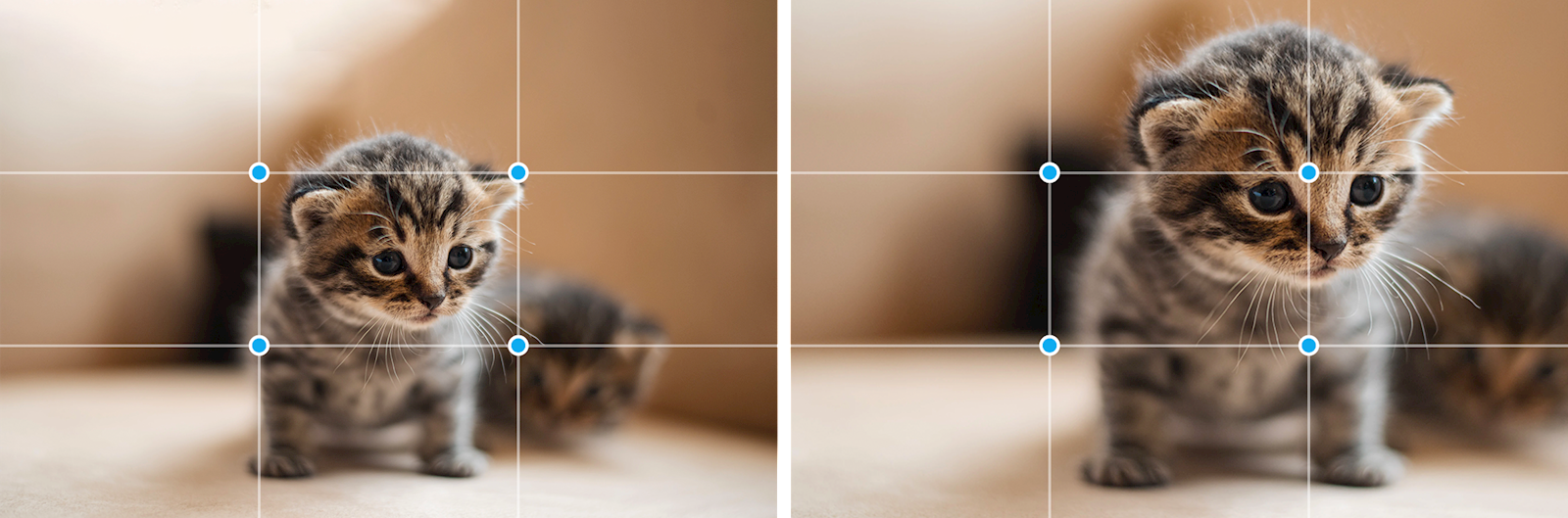
Just as important as writing good content is choosing high-quality, visually interesting images. A good rule of thumb to follow when choosing or editing images is to follow the rule of thirds. This rule recommends that you look at your photo and break it into thirds horizontally and vertically. Imagine a 9x9 grid over your image -- the points where the gridlines intersect are the points of interest that provide a good guideline for where the focal point of your photos should be.
We can illustrate this using the currency of the internet—cat photos. In the image on the left, the focal point of the picture is placed in the center box leaving a lot of clunky dead space around the cat. Contrast that with the more tightly cropped version on the right. The cat’s eyeline hits right on one of those four points of interest (highlighted by the blue circles) and helps give the photo a more dynamic, interesting layout.
White Space is Good
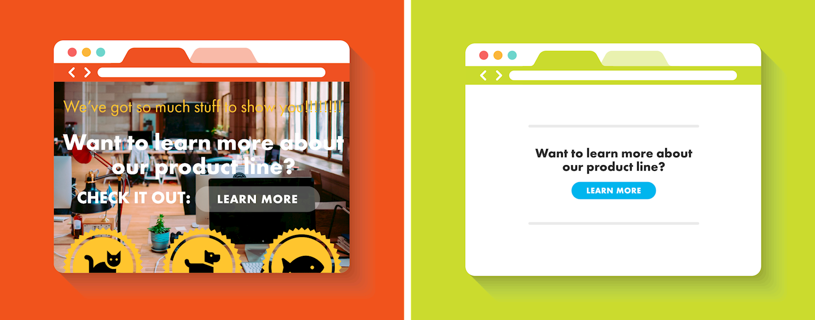
Putting too much content on a single page adds clutter and results in a poor user experience. Simple is good. White space (also called negative space) is good. It gives the readers’ eyes a break to take in what they have just read, seen or watched. Don’t be afraid of white space. Modern design is clean, fresh, simple, and beautiful.
Don't feel pressured to create a complicated design. Simple is better. If you find a design you'd like to emulate, contact your developer to create it for you.
Look at the example above. Lots going on there on the left. What should you pay attention to? It's easy to get overwhelmed with too much information. The simplified version on the right, with ample white space, simple text and a high-contrast call-to-action button, helps the reader focus on what's important - learning more about the product.
Keep it Visual

Images throughout the page can help separate your content and keep it from looking like a giant, daunting block of text. Users who feel intimidated by your page content might decide to try another website, so you want to make sure your page looks both attractive and digestible. Be sure you either own the photographs or have credited the photographer appropriately. Here are some other tips:
Put a Lead Image at the Top
This should be the largest image and also meaningful to the content of the page. Avoid putting something there just for decoration. People will want to read your page and take action.
Add Multiple Images
Images can help separate your content and stop users from scrolling, enticing website visitors to stay awhile. Think about 1 visual every 200 words or so.
Be Consistent
Establish a style guide for your site with specific aspect ratios to use for images. You don’t want your page to look like a hodgepodge of different image sizes. You want every element of the page to feel intentional and consistent. Paying attention to the little details on your site will help subtly reinforce your company’s commitment to quality in the eyes of your users. Ask your web designer to create two or three options for images on your subpage templates.
Dos and Don'ts for Basic Website Design
Do:

- Do add alt text
This is easily overlooked but important for SEO and to meet accessibility standards. See below for our blogpost about alt text and learn how to add it in LRS Antilles CMS.
- Do use keywords as filenames.
You could leave the file name as IMG_123456789.jpg, but changing to a more meaningful file name such as “landscape-patio-walkways122.jpg”, which includes multiple keywords, will help your SEO for image searches – and make it easier to find in your files.
- Do find a balance between images and text.
You want the page to be visual, but add too many photos and your page can look cluttered. It also can slow down your page speed.
- Do design first for mobile devices.
Put the most important content closer to the top. Don’t put too many images at the top – it will make your website slow to load and without intriguing words and calls to action, users may skip out.
- Do repurpose text with graphics like infographics.
Get more bang for your buck by making the valuable information visual and repurpose it on your website and social media channels.
Don’t:

- Don’t take an image into an editor and add text to your image.
Images will display differently depending on the size of the device the website user chooses. On some devices, the text you’ve added to your image can end up being too small or hidden entirely, making it impossible for the user to see the information you wanted to convey. Make sure that important titles and copy are actual, crawlable text that can optimize itself to fit their experience no matter how a user has accessed your site.
- Don’t use flyers to convey information. Page-width jpegs are not mobile-friendly and the text isn’t searchable. And if there’s no alt text, the picture won’t be accessible to users with disabilities. If it’s not readable on a mobile device, it’s just not easy to read, period. The picture will be meaningless. If you like the graphic look, use Canva or Photoshop to create an infographic. But be sure to include the information you want to convey as crawlable text, as well.
- Don't use a lot of script fonts. They are hard to read, even in graphics. Use them sparingly.
 The text on this flyer doesn't translate into webpage text.
Use the Built-In Features of Your Website Design
Your CMS likely came with pre-designed templates for webpages and design elements or custom-designed elements for your company's website. Use them! Check your website style guide and be sure you understand what the design elements are and how to use them. Ask your website designer if you have questions. These templates will make webpage design a lot easier and faster for you.
Get Inspired
Take a fresh look at websites you visit often. What do you like? Dissect the design of the page and think about why it appealed to you. Did it match some of the tips we've mentioned? Incorporate some of those qualities into your site. And if you feel like you need a little more direction, the LRS Web Solutions team is always more than happy to lend a hand.
Source: Cxl.com