Leaving for vacation? Ready to unwind and check out from the day-to-day grind? Since you’re such a dedicated employee, you might be taking your laptop with you and get an itch to do something constructive.
Here’s an easy way to return to your office with some insightful analysis: Take a fresh look at your website on your mobile device.
“But I look at the website all the time!” you might say.
So why now? Because you’re a different person away from the office. At your desk, you may not be able to objectively evaluate your user's experience.
Use your vacation as an opportunity to clearly look at the mobile-friendliness of your website with rested, vacation eyes. It’s your chance to stop being your company’s marketer or IT specialist and put yourself in your customer’s sandals.
Plus, Google is now looking at the mobile version of websites first. Back in April 2019, Google confirmed what most web developers believed: Google’s algorithm would place a higher value on the mobile-friendliness of websites as a ranking signal. That means that if your site isn’t optimized for mobile, search engines may favor a competitor over your website.
What does “optimize for mobile" mean? It’s also called “responsive” web design, meaning the site will “respond” and resize for different-sized screens. There are other factors, but design elements are the biggies.
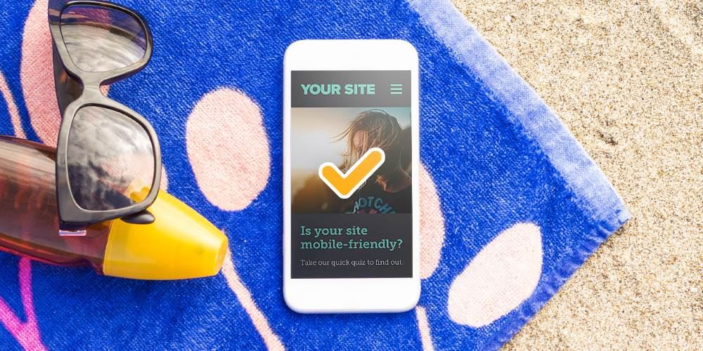
So kick back, grab a frosty daiquiri and take a quick look at the questions below and see if your website is mobile-friendly. (We recommend performing this test while you’re lying on the beach.)
6 Easy Questions to Check if Your Website is Mobile-Friendly:
1. Did the site fully load in 1-3 seconds?
This one’s non-negotiable.
If your site takes longer than a few seconds to load on mobile:
- Users get impatient
- Bounce rates go up
- Conversions go down
Ask yourself a couple of questions: Did you feel like you were waiting? Did images load in slowly? Did you consider closing the page?
If you answered yes to any of those, your load speed likely needs attention.
2. Do the photos look like you expect?
Images should help your site, not hurt it. Let’s quickly check your photos. Are they blurry, overlapping, or just plain broken? There's probably a technical reason behind it.
If something looks “off,” your users notice it too.
3. Do you have to scroll left and right to see all the content?
In other words, does your website actually fit on the screen?
Your website should:
- Fit within the width of the screen
- Not require horizontal scrolling
- Adjust naturally to different screen sizes
If you’re pinching, zooming, or sliding left to right to read content, that’s a red flag.
4. Is the text large enough to read without pinch and zoom?
No one, and I mean no one, wants to zoom in just to read your website. Does reading feel like work? Well, if it does, users won’t stick around long enough to learn what you do.
5. Can you click the buttons and links easily?
Let’s try an exercise. Try navigating your website just using your thumb.
Pay attention to:
- Buttons that are too small
- Links that are too close together
- Menus that are hard to open or close
If you keep tapping the wrong thing, your users probably are too. That frustration adds up fast.
6. Was the experience...pleasant?
Ask yourself:
- Would I want to browse this site if I weren’t connected to it?
- Does it feel smooth, or does it feel like work?
- Am I enjoying this, or am I just tolerating this?
If your site feels clunky, confusing, or just a little irritating, users won’t stick around long enough to figure out why.
If you answered “no” to any of these questions, your site may be in need of some technical tweaks. Your website should be so easy to use and such an enjoyable experience, your customers won’t mind looking at it, even when they’re on vacation.
LRS Web Solutions can help get your site mobile-friendly. Here’s what to do next.
Two Clicks and Help is on the Way
Just fill out the quick form to send us an alert. We’ll get in touch when you’re back in the office and talk about how we can turn your website into a mobile-friendly site.
When you get back to the office, you’ll have valuable information and an action plan for the boss.
What a good employee you are! You deserve a vacation. 😉