
How many times have you seen a beautiful website and said, “I want our site to look like that.”
It’s tempting to look at a competitor’s website and try to mimic its design. But just because it’s pretty, doesn’t mean it’s accessible. Beautiful designs are not always accessible, not always fast loading, and not always the best fit for your company.
Would you rather have a website that is beautiful or functional – or both?
A beautiful website that functions poorly for users with disabilities is like a beautiful skyscraper with only staircases connecting its floors.
It's not only inaccessible for those with disabilities but it fails to deliver an optimal experience for virtually everyone else.
Many website redesigns fail to include a large demographic: users with disabilities. According to the World Health Organization, severe vision impairment alone affects 2.2 billion people around the world.
For businesses, an inaccessible website means that a significant portion of potential customers may be cut off from your products and services.
Request a Free Accessibility Scan for your Website A service from our partner, Monsido. Free for a limited time!
Why is Accessibility Important?
The Worldwide Web Consortium (W3C), the governing body of the internet, outlined a set of international guidelines called the Web Content Accessibility Guidelines (WCAG) 2. These guidelines outline three levels of Accessibility: A, AA, and AAA. Our aim is Level AA Compliance.
Accessibility needs can be broken down into three types:
1. Permanent disabilities, such as visual impairment,
2. Temporary Disabilities, such as broken fingers, and
3. Situational Disabilities, where for example, you might be cooking with one hand, holding a toddler in another arm while trying to place an order on a website.
You can see that website accessibility applies to everyone.
Fixing accessibility issues can further optimize your website and help your SEO through improved keyword use, page load time, user experience, and more.
Learn More about the Importance of Web Accessibility
What Do All These Terms Mean?
Are you trying to fix accessibility problems yourself or has your developer sent you a list of things he says need to be corrected? Unless you’re a developer, website content managers may not know what the esoteric terms mean. Still, it's important to understand the problems and learn how to avoid them in the future.
You could save a step and partner with a company like LRS Web Solutions. We run each website project through an accessibility checker and fix those issues before the launch of our projects. This with the help of our partner Monsido, a website governance company.
After fixing accessibility issues on hundreds of websites, LRS Web Solutions' developers Tyler Winters and AJ Troxell are sharing the top problems they see in our reports from Monsido. As an added bonus, Monsido accessibility specialist Sterling Rose and Alasdair Nolan also lend their expertise.
Below you'll see the top 5 problems we encounter in most website projects. We’ve quoted the common errors in the language used by WCAG. But don't worry, we’re translating them into laymen’s terms, with examples, and showing you how to fix it.
Take a look and ask – does your website have these problems? If the answer is yes, or if you’re not sure, contact us to get help with these 5 and other Website Accessibility problems.
Top 5 Website Accessibility Problems
- Text/Structure
- Design Contrast
- Site Functionality
- Menus/Navigation
- Image Problems
1. TEXT/STRUCTURE
Written content is the backbone of any website. People want to have a question answered, find directions, or purchase a product or service. If your text doesn’t make this experience easy and pleasurable, you risk losing a sale and some of your reputation.
“SEO is very important here,” Sterling says. “Label everything, including page titles, H1s, H2s, alt tags, etc. Screen readers will tab through the headings so that users can hear the content in order the page.”
Error: “No link description/Link text isn’t meaningful when read out of context."
What this means: Web users recognize the blue, underlined text as a link. Links are an important part of the website user’s experience. In addition to color contrast, the text of the link is an important part of usability. If every link on your website is labeled “Click Here” or your company name, that text isn’t helpful for screen readers. “You want to make sure your text has meaning beyond ‘click here,’” Sterling says.
How to Fix It: Re-imagine your link text with text that is more specific and purposeful– “Download the Newest Catalog” or "Start My Mortgage Application.” People using screen readers can easily understand the links on the page. Sterling adds that the links should be short and unique to help speech recognition technology.

"Click here" is not the best link text.

The best link text tells the user what will happen when they click on the link.
Error: "Tables aren’t structured correctly."
What this Means: For websites, tables can be a big problem in terms of accessibility. “Tables are specifically for tabular data.,” says AJ Troxell, senior web developer and accessibility specialist at LRS Web Solutions. “Think about how you would present the information. If you wouldn’t present the data in an excel spreadsheet, that is, easily readable and consumable from top to bottom and left to right, it does not belong in a table.”
How to Fix It: Look at the content you’re putting into a table. Is there another design option? Check with your web developer for a more user-friendly, mobile-friendly option.
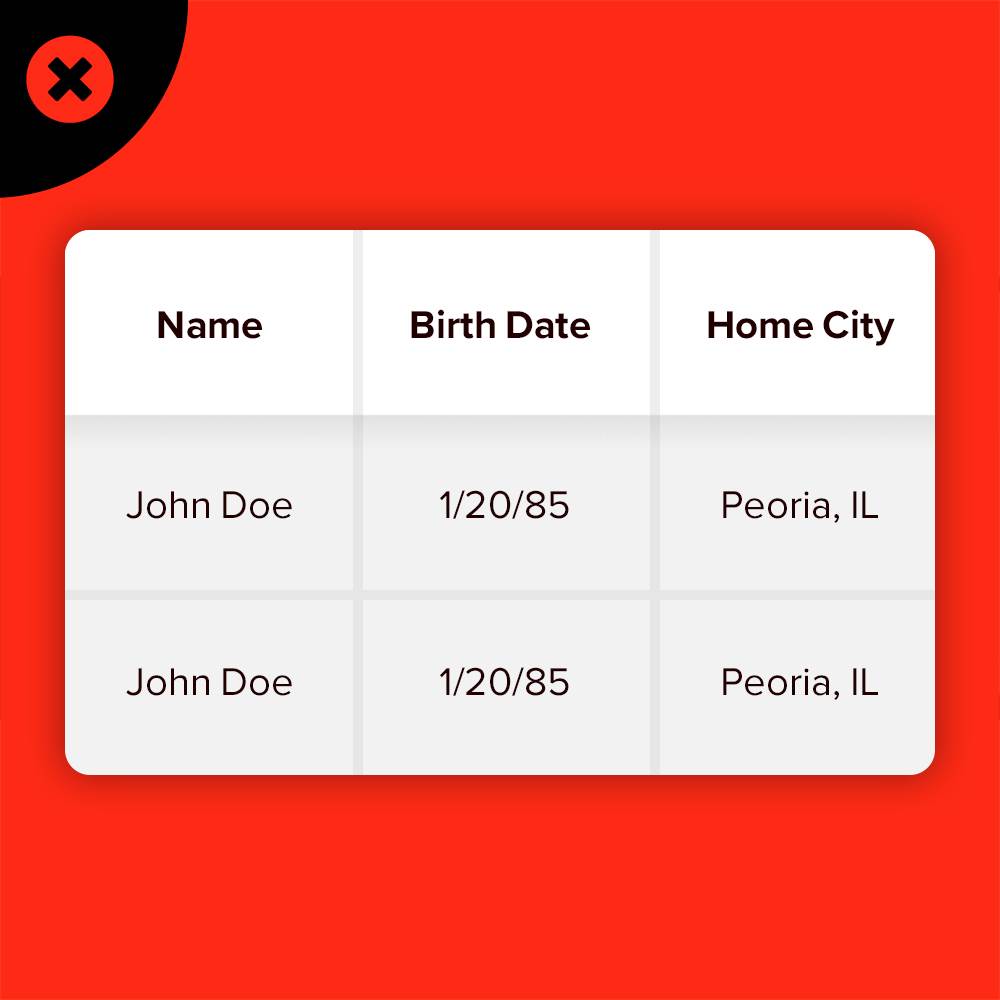 Tables are good for spreadsheets but not the web.
 Present your information in a usable way
2. DESIGN CONTRAST
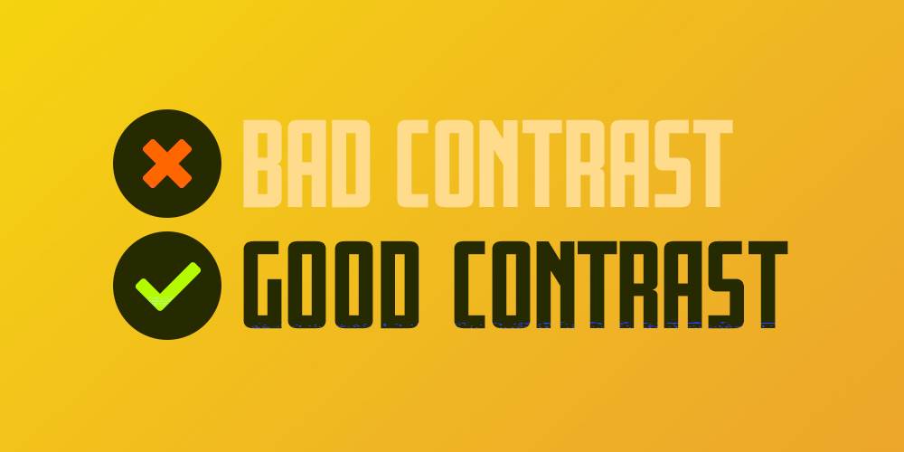
According to Monsido, “People with low vision often have difficulty reading text that does not contrast with its background. Providing a minimum luminance contrast ratio between the text and its background can make the text more readable for users who cannot see the full range of colors and also helps those rare users who see no color.”
Professional website designers are experts in the elements of design, including contrast. Blending beauty and creativity with an understanding of how to meet accessibility, you can avoid these common errors related to design contrast:
Error: “The luminosity contrast ratio between text and background color in all images is less than 5:1.”
Error: “Link text colors don’t contrast sufficiently with the background color.”
What this Means: The color of the link doesn’t contrast with the color of the background. For example, red text on a white background, or a light orange to match your company’s brand on a white background. That makes text hard to read for people who are color blind or have low vision.
How to Fix It: Remember this for all three link types: Selected, Active and Visited Links. “Consider all coloring on your website, including text, links and background,” says Sterling. “This also assists many types of visual disabilities, such as color blindness and dyslexia.”
Monsido has developed its own color contrast tool that lets you put in the web color code to get the contrast ratio. Aim for a contrast ratio of at least 4.5:1. If you’re using large text, like a headline, the contrast ratio should be a minimum of 3:1.
Here are some examples of bad contrast and good contrast in text design.
3. SITE FUNCTIONALITY
The architecture of a website supports accessibility when done correctly. This takes a significant amount of skill and professional experience to be all-inclusive. Be sure to consider your page layout and flow,” Sterling points out. “Sometimes less is more.”
People with disabilities often depend on the keyboard only to browse websites.
Error: "The content does not function accurately on different display types."
What it Means: Search engines now take a mobile-first approach (and so do we at LRS Web Solutions for our website designs). Mobile-First aka "responsive" means that the website adapts to whatever screen size the visitor is using. So if you’re only looking at your site on your desktop, you may not see problems that are evident on a tablet. These issues are important to fix for all users, including persons with disabilities.
For example, make sure that the user doesn't need to scroll side to side to see content that may be running off the page.
How to Fix It: "Content should be created with all devices in mind from the very beginning and consideration given to their respective needs," notes Alasdair Nolan of Monsido.
You'll need a developer to manually test the different display types (tablets, mobile phones, etc.) to make sure the content stays within the boundaries of the window.
Nolan also recommends checking that content is visible in all light conditions, ensuring that text is legible on all devices (size, contrast, etc.) and that the navigation menu is easy to understand and touch on mobile devices.
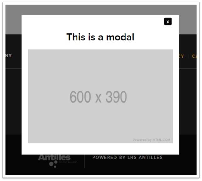
Error: “User interface for scripts must be accessible”
What it means: Certain website elements like modal popup messages use advanced computer coding called “scripts.”
While these elements help with marketing messages, don’t forget to make them accessible. Tyler explains, “When implementing popups or modals, you want to make sure that once the modal is revealed, that the modal becomes the focusable item. Not only that, but you want to make sure you 'trap' the user’s keyboard key-presses from leaving the popup modal on accident.
Providing a ‘Close’ option to leave the modal would be good practice.
Pressing the "Close" button would hide the modal and return the user back to where they were before activating the modal."
How to fix it: Be careful using popups and other elements. They may make it difficult for screen readers to separate the foreground from background content.

The main navigation menus must be accessible. This means a user should be able to access any and all menu items in a navigation area whether they are using a mouse or a keyboard. People with disabilities often must use a keyboard to navigate through a web page. Without accessibility coding, users may not be able to access all the items on a page, or it may be cumbersome to get to the content they want.
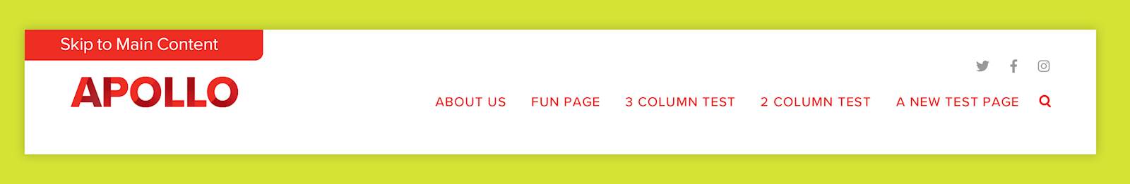
Error: “Web Page Document May Be Missing a 'Skip to Content' Link.”
What This Means: “Without a 'Skip to Main Content' link, the user has to tab through main navigation links to get to the content they want to read. And they’ll have to do this each time they visit a new page,” explains LRS Web Solutions web developer Tyler Winters. “When the 'Skip to Main Content' link is clicked, the user will skip over all focusable elements before the main content section of the web page.”
How to Fix It: When using keyboard navigation, the first focusable item on a page should be a link that skips over the main menu navigation takes the user directly to the main page content. Make sure when tabbing through the main navigation, that an option to see and access the nav item’s children pages (or flyout) occurs.
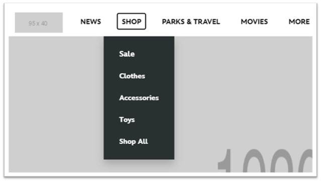
Passing Navigation
The below image shows that when the Shop nav item becomes focusable, it’s children pages in a flyout appear. This allows the keyboard user to see and access the nested menu items under Shop.
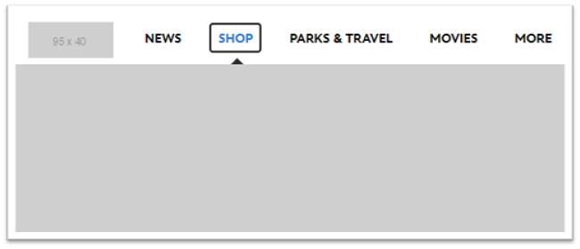
Failing Navigation
Now that we know the Shop menu item has children pages nested within it, you can see how the below image would be an example of a menu being inaccessible as a keyboard user is unable to see or access the menu items nested within the Shop menu item.
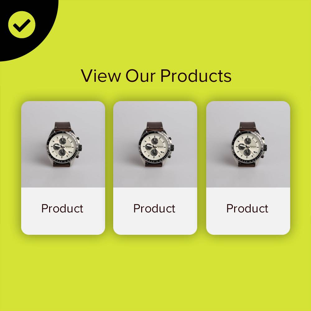
5. IMAGE PROBLEMS
No website is complete without beautiful images. Photographs, background images, infographics, charts, all these design elements are critical to a user’s experience. But they’re also a primary source of frustration for those with disabilities.
Error: Labels don’t reflect the text contained in an image (meaningful text)
What This Means: Imagine that you are a visually impaired user shopping online. You click on an image of a coffee maker. Instead of a description of the product’s features, you hear: “Link id content underscore c t one three seven eight thumb zero dot jpeg”. Not very helpful, eh?
Alternatively, If an image fails to load the alt text is shown. If there is no alt text, screen readers will not be able to interpret the image, and users may miss out on important details of the image and how it relates to the text content.
How to Fix It: Alt text for images should be specific and descriptive, but not redundant. So if you have an image, be specific. Don’t just write “King Solomon.” Instead, take a minute and write, “King Solomon sits on his throne with his followers around him.”
Keep alt text short and concise. Begin alt text with "image of" or "graphic of", according to Monsido experts.
AJ notes a caveat. “If the image is just decorative or a background image, no alt text is needed. But make sure you have the empty alt text code."
Let’s look at two examples using the same image.
 If the following image is used with the text, “Flowers are one of the most beautiful plants we have on this planet.”
We could add alt text to this image, but it is not necessarily needed because the sentence that it goes with doesn’t require us to use an image at all. This image is simply decorative and would provide no benefit to the reader whether the image loads or not. So in this case, we’d only need to make sure that we add an alt attribute, but we can leave it empty like this: <img src=”.tulips.jpg” alt=””> .
Now let’s take the same image and accompany it with a new sentence that reads: “In the photograph below, you can see how the color of the tulips really pops against the blue sky.”
In this case, we’d want to add some type of alt attribute that describes the image. Here’s an example of what could work: <img src=”.tulips.jpg” alt=”A group of red tulips with a blue sky in the background.”>
Get Ahead of the Lawsuits
Fixing website accessibility issues isn’t a “fix and forget it” task to prevent lawsuits. Sterling notes, “There isn't a 'passing grade' written in black and white. It is very grey, unfortunately.”
So what is the best course of action?
“The best thing people can do is have a proven consistent effort on the website. It's not a 'one and done' project, but requires on-going maintenance. There is really no such thing as a 100% accessible site. But working towards it is the best thing to do.”
That’s where LRS Web Solutions and Monsido can help you keep your website on track to meet accessibility standards.
If you think your site might be guilty of one of these top 5 accessibility issues, contact us and take advantage of a free website accessibility audit. It’s the smart thing to do for your business success, for your legal peace of mind, and frankly, it’s just the right thing to do.